
Arc Text Generator
Bend Text Along an Arc Online
Transform straight text into elegant curved arcs with a single click. Adjust the curve radius and direction, choose your font, then export a transparent PNG — perfect for logos, headers & signage.
- Smooth arc curves
- Works on phone & desktop
- Transparent PNG export
What Is an Arc Text Generator?
An arc text generator is an online tool that bends your text along a smooth arc — a segment of a circle. Unlike full circular text, arc text curves only a portion of the way around, creating elegant banner-style layouts for logos, headers, signage, and decorative elements. With CurvedTextMaker you can draw any arc freehand, control the curve radius and direction, choose any font and color, then export a high-resolution transparent PNG — all in your browser, completely free.
How to Make Arc Text
Create beautifully curved arc text in under a minute. Draw, customize, and export — no design skills required.
Draw an Arc Path
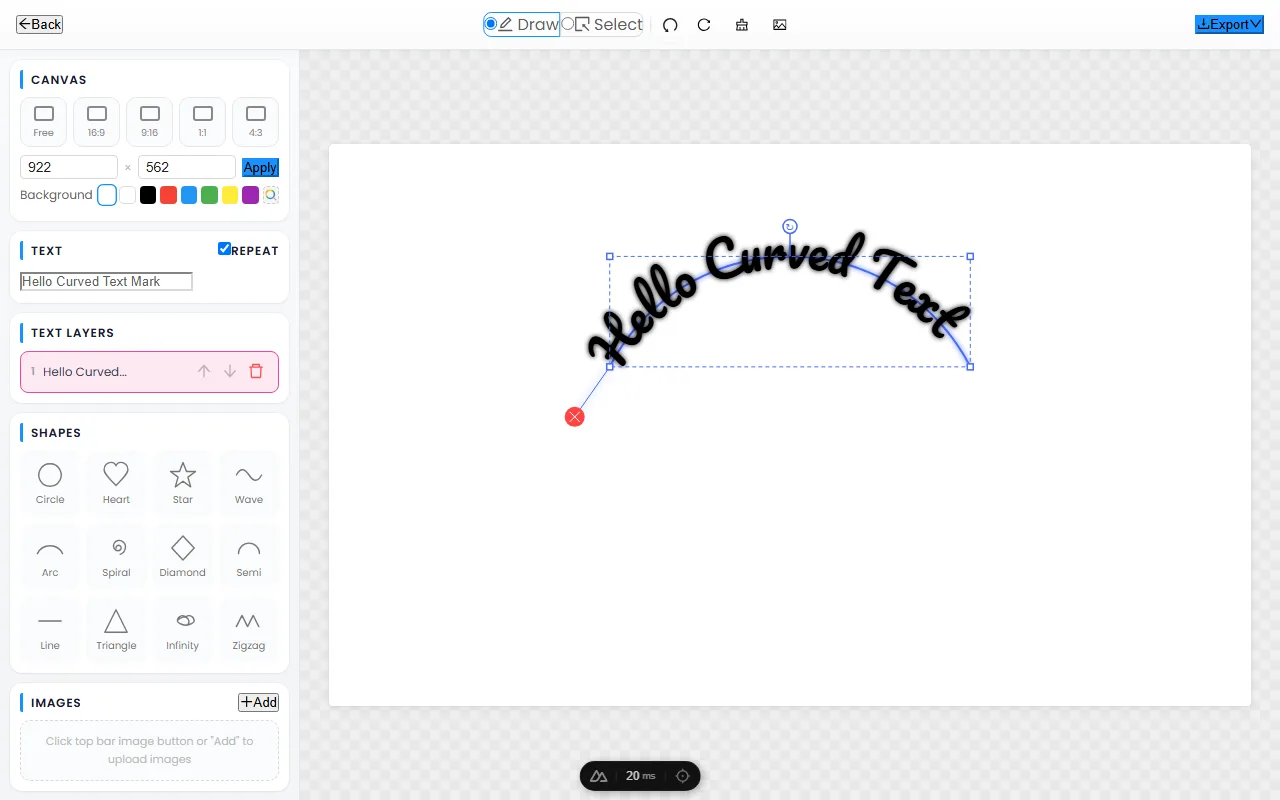
Open the editor and click-drag on the canvas to draw an arc. Your text follows the curve instantly — make it a subtle bend or a dramatic half-circle, whatever your design needs.
Customize Font & Style
Choose from dozens of fonts, tweak text size and letter spacing, pick any color, and add shadow effects. Change the background or keep it transparent for maximum flexibility.
Export Transparent PNG
Click "Export Text" to download a high-resolution PNG with a transparent background. Drop it onto any image, video, poster, or presentation — it blends in perfectly every time.
The Best Free Arc Text Generator
A powerful arc text tool that works right in your browser — no downloads, no accounts, no limits.
Any Arc Shape — Subtle to Dramatic
From gentle banner curves to dramatic half-circle arcs, CurvedTextMaker handles them all. Draw freehand to create exactly the arc you need, or combine multiple arcs for top-and-bottom logo text layouts.
Works on Every Device
Our arc text generator is fully responsive and works seamlessly on desktops, tablets, and smartphones. Use your finger on mobile to draw arc paths just as easily as a mouse on desktop.
Transparent PNG — Drag & Drop Ready
Every exported image has a transparent background by default. Overlay your arc text onto photos, videos, logos, or any creative project without extra editing. What you see is what you get.
Arc Text: Banners, Eyebrows & Logo Arches
Arc text follows part of a circle rather than the full ring, which makes it the workhorse layout for banner headlines, the small "eyebrow" text above photos and logos, and the arched wordmarks on signage. This guide explains when an arc beats a full circle, how curve angle and radius affect readability, the three classic arc styles, and how to pair arc text with images.
When to choose an arc over a full circle
Arc and circle text solve different problems. A full circle reads as a badge, seal, or emblem — enclosed, official, decorative. An arc reads as a headline, a label, or an accent — directional and easy to scan.
- Use an arc for banner headlines, eyebrow text above a subject, arched signage, and any logo where the text should lead the eye.
- Use a full circle for emblems, stamps, coins, and badge-style logos where the text frames a central icon.
- When in doubt, reach for the arc — it keeps long words readable while still feeling designed, where a full circle would force you to cut copy.
Arc angle and radius: the readability tradeoff
Two controls decide how your arc reads: the angle (how far around the circle the text sweeps) and the radius (the size of that invisible circle).
- A shallow angle (a gentle bend) barely tilts the letters, so multi-word phrases stay highly readable — ideal for headlines and eyebrows.
- A wide angle (approaching a half-circle) tilts end-letters steeply, which looks dramatic but gets harder to read; reserve it for one or two words.
- A larger radius produces a gentler curve for the same text length, which is the single easiest way to improve legibility. When an arc feels cramped, enlarge the radius before changing anything else.
Three classic arc styles
Most arc-text designs fall into one of three patterns:
- The banner arch — text curves upward over a title or image like the top of a ribbon. The go-to for poster headlines and retro signage.
- The eyebrow — a short, gently curved label sitting above a logo, photo, or section title. Adds polish without competing with the main headline.
- The smile (underline) — text curves downward beneath a wordmark, mirroring a banner arch. Pair a top arch with a bottom smile to frame a central icon without committing to a full ring.
Pairing arc text with images and logos
Arc text is at its best when it frames something. Place the arc above the focal point of a photo so the curve "opens" toward the subject, and leave breathing room between the text and the image so neither crowds the other. Over busy photographs, add a subtle shadow or a semi-transparent backdrop behind the letters — without contrast, even a well-drawn arc disappears. For logos, keep the arc weight matched to the central mark: a heavy icon calls for heavier arc text, a delicate line-art mark calls for lighter type. Consistency in weight is what makes an arc feel like part of the logo rather than a sticker on top.
Frequently Asked Questions
Open CurvedTextMaker, type your text, then draw an arc path on the canvas. Your text follows the curve instantly. Customize the font, size, color, and spacing, then export a transparent PNG.
Arc text curves along a segment of a circle — like a banner or smile shape. Circle text wraps all the way around a full ring. Arc text is ideal for headers, logos with curved banners, and signage, while circle text is best for emblems and stamps.
Yes — CurvedTextMaker is 100% free with no hidden costs, no sign-up, and no watermarks. All features are available at no charge, including multiple fonts, colors, and high-resolution transparent PNG exports.
Absolutely. Draw the arc upward for a "smile" shape or downward for a "frown" shape. You can even combine two arcs — one curving up and one curving down — to create classic logo layouts with text above and below an icon.